¶ Overview
The Generation Source Production page shows energy production as a time-series bar chart for the selected generation source. This view is calculated for the entire source (for example, the sum of all solar inverters or the whole battery system), not a single device.
Displayed data depends on the source type:
- Solar / Wind — Actual production compared to estimated (available) production.
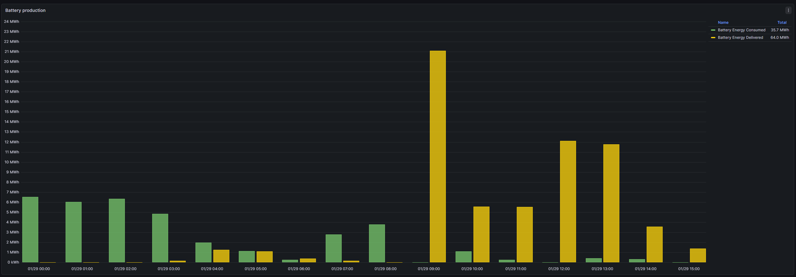
- Battery — Consumed energy (charging) and Delivered energy (discharging).
Note: This page is source-aggregated. For per-unit analysis, use Each device production.
¶ Controls — Period
Use the Grafana time-picker (top-right) to select the overall time window, then choose the Period to control aggregation (10 minutes, hourly, daily, monthly). Press Refresh after changes.
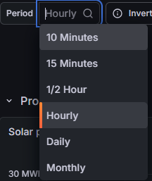
- Short periods — intraday detail.
- Hourly / Daily — operational review.
- Monthly — reporting summaries.
¶ Solar & Wind — Production vs estimated
For Solar and Wind, bars compare actual produced energy to an estimated / available production reference. Gaps indicate curtailment, outages, or performance loss.
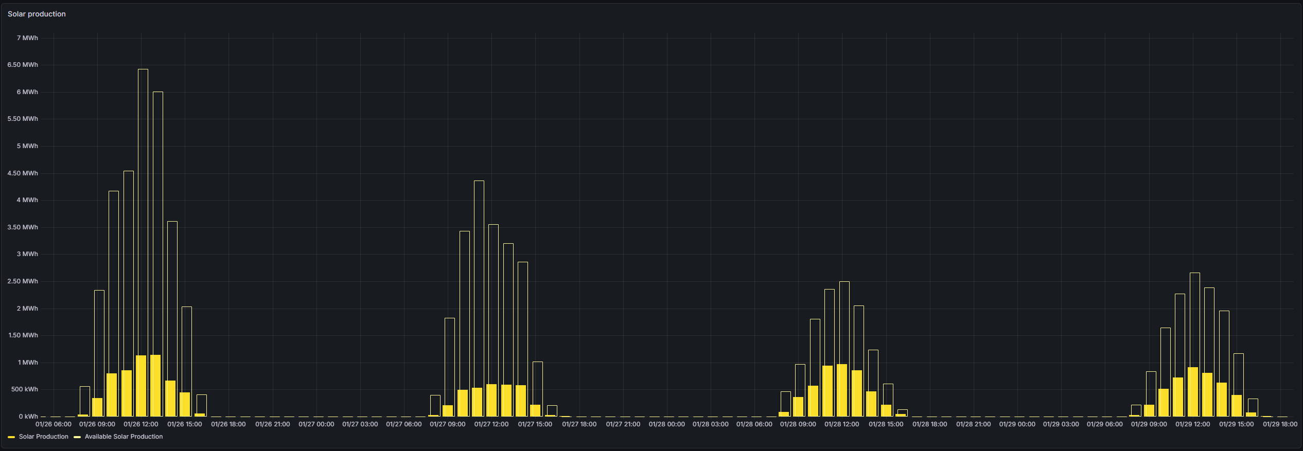
Tip: Use shorter periods to isolate loss windows; longer periods reveal trends.
¶ Battery — Consumed vs delivered energy
For Battery sources, the chart shows bidirectional energy flows: Consumed (charge) and Delivered (discharge). This summarizes dispatch behavior and throughput.