¶ Overview
The Production view shows plant energy as a time-series bar chart. Use the Grafana time-picker (top-right) and navigation arrows to select a time frame, then choose the calculation period (granularity) and data source from the controls at the top-left. A Nord Pool price line overlays the chart for context and can be toggled in the legend.
Note: Very coarse periods (e.g., monthly) may hide the price overlay automatically. Press Refresh after changing time.
¶ Controls — Period & Source
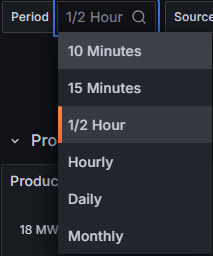
- Period — sets how energy is summed per bar. Shorter periods reveal intraday detail; longer ones show trends.
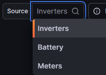
- Source:
- Inverters — energy reported by inverter controllers. Helpful for device benchmarking, but does not include line/transformer losses to TP.
- Meters — energy at the TP/POI. Most realistic plant production because it includes downstream losses and AC collection effects.
- Modeled — theoretical energy from a physics/resource model built on irradiance and ambient temperature (and site-specific parameters). Represents the possible production for the period.
- Model Delta — difference between Actual (Meter) and Modeled. Highlights lost or extra generation due to curtailment, outages, clipping, or model mis-tuning.
¶ Reading the Chart
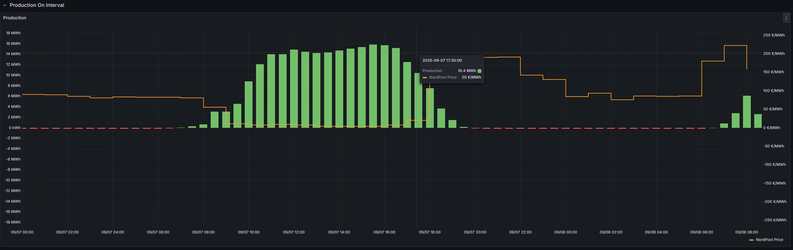
- Green bars — output energy per period (kWh/MWh) from the selected source.
- Red bars — input energy per period (kWh/MWh) if calculated.
- Orange line — Nord Pool price (€/MWh) aligned to the same time axis.
- Zoom & isolate — drag to zoom, Ctrl/Cmd + Z to step back; click legend to toggle traces.
Reliability tip: For settlement and business KPIs, prefer Meters. For device performance and availability, use Inverters. Compare against Modeled to understand weather-normalized gaps.